The transition to mobile-first indexing has been a multi-year journey for Google, but in 2026, the paradigm has shifted from "mobile parity" to "mobile supremacy." If your website's mobile experience is an afterthought, your organic visibility will inevitably suffer. The fundamental rule of the modern SEO landscape is absolute: Googlebot Smartphone is the primary crawler, and the mobile version of your DOM is the single source of truth for indexing, ranking, and entity extraction.
This comprehensive guide delves into the advanced mechanics of mobile-first indexing, exploring enterprise-scale auditing techniques, the architectural superiority of Static Site Generation (SSG) over legacy monolithic platforms like WordPress, and the precise optimization of rendering paths to ensure maximum crawl efficiency. Whether you are running a localized service directory with 500 pages or a massive programmatic SEO architecture scaling to 50,000+ pages, mastering mobile-first indexing is the technical baseline for algorithmic survival.
The Architectural Flaws of Legacy Systems
Before diving into the audit frameworks, it is critical to understand why legacy systems like WordPress consistently fail in a mobile-first world. WordPress relies on synchronous PHP execution, database queries (MySQL), and often, bloated premium themes that serve a monolithic CSS and JavaScript payload to the client. When Googlebot Smartphone requests a URL, the time-to-first-byte (TTFB) is bottlenecked by backend processing.
Furthermore, responsive design in legacy CMS ecosystems often means downloading the desktop assets and relying on CSS media queries to hide them (display: none). This results in massive, unused payloads being delivered over constrained mobile networks. The Googlebot renderer must parse, compile, and execute this bloated JavaScript, burning through your crawl budget and resulting in partial indexing. This is particularly devastating for enterprise architectures where crawl budget allocation directly dictates revenue. If Googlebot spends 80% of its allocated crawl time downloading unoptimized CSS frameworks for a mobile layout, thousands of deep programmatic pages will remain de-indexed.
The SSG Advantage
Modern web architectures, specifically Static Site Generation (SSG) via frameworks like Next.js, flip this paradigm. With SSG, the HTML is pre-rendered at build time. When Googlebot Smartphone requests a programmatic SEO page, the Edge network (e.g., Vercel, Cloudflare) immediately serves the fully-formed, optimized HTML document.
- Zero Backend Latency: TTFB drops to low double-digit milliseconds. The server does not need to compute database joins or parse PHP; it simply delivers a static file from a globally distributed CDN.
- Minimal JavaScript Payload: Hydration is deferred or localized (using React Server Components), meaning the mobile DOM is immediately available without blocking the main thread.
- Crawl Budget Optimization: Because pages load instantaneously, Googlebot can crawl thousands of pages per second, a critical requirement for programmatic SEO campaigns targeting tens of thousands of local service pages.
Phase 1: Validating Mobile-Desktop Parity at Scale
The most common point of failure in a mobile-first index is a lack of parity between the desktop and mobile DOMs. If content, structured data, internal links, or meta tags are stripped from the mobile version to "save space," Google will drop them from the index entirely. Google evaluates the mobile DOM explicitly; if your desktop version features an expansive "Related Services" internal linking matrix but your mobile version hides it behind a client-side JavaScript hamburger menu, those critical PageRank signals evaporate.
Content Parity
You must audit your CSS and JavaScript to ensure that critical content is not hidden from the mobile DOM. In dynamic React applications, developers often erroneously use viewport-based conditional rendering.
// Anti-Pattern: Hiding content in React based on viewport
function ServiceDetails({ data }) {
  const isMobile = useWindowSize() < 768;

  return (
    <div>
      <h1>{data.serviceName}</h1>
      {/*
        CRITICAL SEO ERROR:
        This description will NOT be indexed by Googlebot Smartphone.
        It does not exist in the DOM during a mobile crawl.
      */}
      {!isMobile && <p className="deep-technical-specs">{data.specs}</p>}
    </div>
  );
}
The Solution: Serve the exact same HTML payload. Use CSS to manage visual presentation (e.g., accordions or tabs), as Google perfectly understands and indexes text hidden behind CSS display: none if it is structurally present in the DOM for mobile users to expand. Google officially treats content hidden behind tabs (for UX purposes on mobile) with equal weight to visible content, provided the text resides natively in the HTML source code.
Structured Data Parity
JSON-LD schema markup must be identical across both viewports. In dynamic rendering environments, it is easy to accidentally omit the schema injection script on the mobile layout component. Ensure your automated testing explicitly extracts the <script type="application/ld+json"> tag using a mobile user-agent. If your desktop site fires a LocalBusiness schema but your mobile site fails to inject it due to component hierarchy differences, you will lose your Google Maps and local pack visibility.
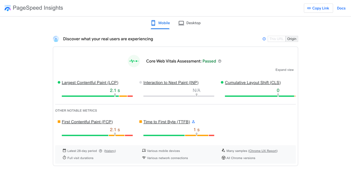
Phase 2: Core Web Vitals and Mobile Rendering Performance
Google’s rendering engine (WRS - Web Rendering Service) operates on strict timeouts. If your mobile page requires heavy JavaScript to render the primary content (Client-Side Rendering), WRS may abandon the process, resulting in a blank page being indexed.
Largest Contentful Paint (LCP) Optimization
On mobile devices, the LCP is typically the hero image or the primary H1 tag. To optimize LCP under 2.5 seconds on a simulated 4G network:
- Preload Critical Assets: Ensure the mobile hero image is explicitly preloaded in the document
<head>. - Responsive Image Optimization: Do not serve a 2400px wide image to a 390px wide viewport. Use the
next/imagecomponent to automatically generatesrcsetattributes. - Avoid Client-Side Data Fetching for Hero Elements: Never render your H1 or primary LCP image via a
useEffecthook. They must be present in the initial static HTML payload.
import Image from 'next/image';

export default function Hero({ title, heroImage }) {
  return (
    <header className="relative w-full h-[50vh]">
      <Image
        src={heroImage.url}
        alt={title}
        fill
        priority // Tells Next.js to preload this image and skip lazy loading
        sizes="(max-width: 768px) 100vw, 50vw"
        className="object-cover"
      />
      <h1 className="z-10 absolute text-white">{title}</h1>
    </header>
  );
}
Cumulative Layout Shift (CLS) Mitigation
Mobile viewports are highly susceptible to CLS due to dynamic ad insertions, late-loading web fonts, or unconstrained image dimensions. A mobile CLS score above 0.1 will result in algorithmic ranking demotions.
- Explicit Dimensions: Always provide
widthandheightattributes to images and iframe embeds. - Font Loading: Use
font-display: swapto prevent FOIT (Flash of Invisible Text), but combine it with CSS size-adjust metrics to prevent the fallback font from shifting the layout when the custom web font loads. - Dynamic Injection: Never inject content above existing content. If you are loading localized inventory for a programmatic city page via a client-side fetch, allocate a fixed-height skeleton loader to reserve the DOM space before the HTTP request resolves.
Interaction to Next Paint (INP)
INP measures the responsiveness of the page to user inputs. On mobile, heavy JavaScript execution (React hydration) blocks the main thread. When a user taps a mobile menu hamburger icon, if the thread is blocked, the menu won't open, resulting in a poor INP score.
To audit and fix INP: Use Chrome DevTools Performance tab with a 4x CPU throttle (simulating a mid-tier Android device). Look for long tasks (tasks exceeding 50ms). To resolve this in Next.js, migrate static programmatic SEO pages to React Server Components (App Router), which drastically reduces the client-side JavaScript bundle, freeing up the main thread for immediate user interaction.
Phase 3: Crawl Budget and Mobile-Specific Directives
When dealing with programmatic SEO sites scaling to 50,000+ pages, crawl budget management becomes a primary technical focus. Googlebot Smartphone must be able to discover and parse pages efficiently.
Viewport Meta Tag
The absence of a valid viewport tag is an immediate failure in the Mobile-Friendly Test. Ensure every programmatic template includes:
<meta name="viewport" content="width=device-width, initial-scale=1, maximum-scale=5" />
(Note: Do not use user-scalable=no as it is an accessibility violation and actively harms usability for visually impaired users).
Handling Mobile Overlays and Interstitials
Intrusive interstitials on mobile can trigger algorithmic penalties. Google explicitly targets "intrusive dialogs" that obscure the primary content. If you use pop-ups for lead capture on your local service pages:
- Ensure they do not cover the main content upon initial load.
- Trigger them only on scroll depth (e.g., after 50% scroll) or exit intent.
- Use a banner approach (like a sticky footer) that consumes less than 15% of the mobile viewport height instead of a center-screen modal.
Edge Network Routing and Mobile Caching
At the enterprise level, delivering the exact same HTML structure to both desktop and mobile is ideal, but occasionally you may need to serve distinct architectures based on the user agent (Dynamic Serving). If you utilize Dynamic Serving, you must implement the Vary: User-Agent HTTP header.
Without this header, caching layers (like Cloudflare or Fastly) might cache the mobile version of a URL and mistakenly serve it to a desktop user, or worse, cache the desktop version and serve it to Googlebot Smartphone.
Using Edge Workers (like Cloudflare Workers or Vercel Edge Middleware), you can inspect the incoming user agent and route the request to the appropriate rendering pipeline before hitting the origin server.
// Example Vercel Edge Middleware for Mobile Routing
import { NextResponse } from 'next/server'
import type { NextRequest } from 'next/server'

export function middleware(request: NextRequest) {
  const userAgent = request.headers.get('user-agent') || ''
  const isMobile = /mobile/i.test(userAgent)

  // Explicitly set the Vary header to prevent cache poisoning
  const response = NextResponse.next()
  response.headers.set('Vary', 'User-Agent')

  if (isMobile && request.nextUrl.pathname === '/heavy-dashboard') {
    // Rewrite mobile users to a lightweight alternative view
    return NextResponse.rewrite(new URL('/mobile/lightweight-dashboard', request.url))
  }

  return response
}
Phase 4: Advanced Log File Analysis for Googlebot Smartphone
To truly audit your mobile-first status, you must bypass third-party crawlers (like Screaming Frog or Sitebulb) and analyze the server logs directly. You need to understand exactly how Googlebot Smartphone interacts with your infrastructure at scale.
- Extract Googlebot Smartphone Hits: Filter your server logs for the user agent containing
Mozilla/5.0 (Linux; Android 6.0.1; Nexus 5X Build/MMB29P) AppleWebKit/537.36 (KHTML, like Gecko) Chrome/... Mobile Safari/537.36 (compatible; Googlebot/2.1; +http://www.google.com/bot.html). - Analyze HTTP Status Codes: Are you seeing a high percentage of 500 errors exclusively for Googlebot Smartphone? This often points to a timeout in your rendering pipeline when attempting to execute heavy mobile-specific JavaScript or fetching mobile-specific APIs.
- Crawl Depth and Discovery: Ensure that your internal linking architecture is fully accessible without JavaScript. If your mobile navigation menu relies on an
onClickevent router rather than standard<a href="...">tags, Googlebot will not crawl your site hierarchy. Drop-down menus must utilize semanticnavandatags. - Crawl Frequency by Device: Compare the ratio of Googlebot Desktop to Googlebot Smartphone hits. In 2026, the smartphone crawler should account for 95%+ of all Googlebot activity. If desktop crawlers still dominate your logs, your site has likely not fully transitioned, indicating underlying mobile usability failures that require immediate remediation.
The AiPress Architecture Approach
At AiPress, our programmatic SEO infrastructure is inherently built for mobile-first indexing supremacy. By utilizing a static-first edge architecture, we eliminate the rendering bottlenecks that plague WordPress and PHP monoliths.
Our systems compile thousands of localized pages into pre-rendered HTML. When Googlebot Smartphone requests a URL, it receives the complete DOM instantly. There is no waiting for database queries, no layout shifts, and no main thread blocking during critical rendering paths. We explicitly enforce content parity at the compiler level, ensuring that our mobile DOM perfectly aligns with the desktop experience, guaranteeing that every internal link, schema markup node, and keyword target is successfully indexed.
Conclusion
A technical audit for mobile-first indexing in 2026 is no longer about checking boxes on a generic SEO tool. It requires a deep understanding of browser rendering paths, React hydration mechanics, Edge network caching, and log file analysis. By migrating away from legacy, monolithic CMS platforms and embracing the speed and stability of Static Site Generation, engineering teams can ensure their programmatic SEO campaigns scale flawlessly and dominate the mobile SERPs.
Ready to transform your WordPress site?
Get a free preview of your site as a fast, modern site.
Free preview